Mapped: Move to Action
“Mapped could enrich existing tools and also help you identify where to look.”
Son Olszewski, WeVote Campaign Coordinator, Pomoc
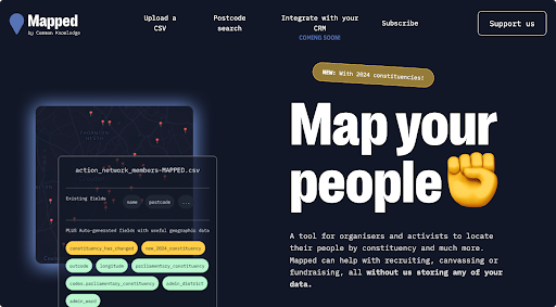
We have previously built a tool called Mapped and a constituency updater which have been used widely and we have had positive, constructive feedback both from our co-design cohort and from others in our community, suggesting common movement tech needs. We’re keen to get the input of more campaigners and organisers to inform future development, so please do check out mapped.commonknowledge.coop and email us your thoughts and ideas!
What we’ve learned is that membership systems tend to be static, siloed and opaque. We think the first step from here is integrating data from other systems into the membership system itself, as well as augmenting it with contextual information, geographic data, constituency boundaries and historical electoral data.
This contextual information could include:
- Branches
- Collaborator organisations and their activities
- Key locations, e.g. hospitals, bank outlets, power stations
- Key dates, e.g. election dates
- Organisational roles of key members, e.g. branch outreach person
- Important equipment and assets, e.g. a printer!
- Custom graphs and charts based on campaign-specific metrics, e.g. NHS waiting times
- Member-submitted data, e.g. canvassing reports, field reports
- Data from external systems
This wouldn’t be a static reference but a generative tool providing intelligence rather than information, configurable to each organisation and its data, structure and strategy. We imagine the digital equivalent to the wall charts used in community organising, a workers inquiry map or even a military intelligence dashboard. This would be a real-time, multiplayer decision-making tool for tracking what’s useful and ground organisational tactics in real information, facilitating radically open collaboration from both organisers, members and other allies.
We have three alphas that over the next few weeks will become a prototype. In software engineering, the term "alpha" refers to an early stage in the software development life cycle. These are early ideas about what features we want Mapped to have.
- The data from our Mapped tool will be visible in our collaborators’ existing Customer Relationship Management (CRM) tools, without repetitive manual effort on the part of organisers.
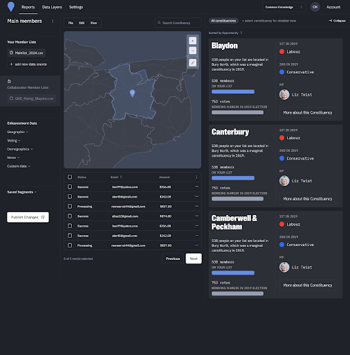
- Organisers can create a series of dashboards or visualisations within Mapped to visualise CRM data, like member locations enhanced with other campaign data. We are thinking of this as a radical intelligence hub
- Organisers will be able to share their dashboards with others in the movement to build electoral coalitions and align their members around a common plan.
We have identified four levels of building this prototype. The first two levels are what we need to make an MVP (a minimum viable product). The third and fourth levels are turning the product into something more full featured. We will be working on this over the next few weeks and will get as much done as we can in that time.
We are also thinking about the build in two phases: data in and data out.
Level 1: CRM User Management
Organisers want to be able to login and view their members so our first task is to set up user accounts on Mapped. We are leveraging MySociety's Local Intelligence Hub to get us going quickly with a web app that will provide this as well as data about local MPs, constituencies, public opinion and the climate and nature movement. Organisers then want to see the data that’s in Mapped in their existing CRMs (such as Action Network, Mailchimp) so we will need to set up synchronisation between the two systems. This is the data in phase as we are adding to the data that is going to be going into Mapped dashboards and visualisations.
In the data out phase, we’re thinking about how we can get the movement’s membership data out of its silos to generate further intelligence and inform campaigns.
Level 2 CRM dashboarding: where are my members?
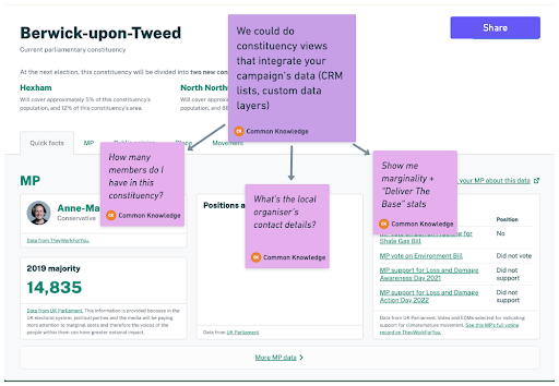
Organisers want to be able to see their members’ locations on maps and other geospatial visualisations. Our sense is that these are more useful than lists for assessing the strength of a campaign because they show the relationships between data in a way that is easy to see at a glance. We would like the maps to contain other information such as an area’s deprivation index, the amount of people in fuel poverty or support for Net Zero.
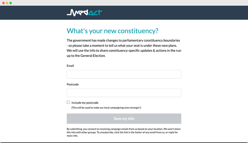
For example, MedAct might want to know how many members they had in the shadow health secretary’s constituency, or Green New Deal Rising might want to know where their members are in relation to energy infrastructure. We are imagining that this data will pull from their CRM rather than a CSV file as it does currently. We value the role of this enhanced data that doesn’t fit neatly into a traditional CRM.
Level 3 CRM dashboarding: electoral coalition-building
The next step after visualising one data source is to layer multiple data sources on top of each other. This will help organisers to build up actionable insights for their campaigns. For example, displaying member’s health stories from that constituency layered with the local MP and their voting record on health issues.
Organisers will be able to share their layers, add to or comment on other people’s layers, have discussions about strategy and make decisions over maps. Another benefit to this is that users can see what other organisations are doing in an area; avoid duplicating work and maximise each other’s impact by working together in a coalition up to the election and beyond.
Level 4 CRM dashboarding: making an electoral strategy
The final iteration of this prototype is to allow organisers to use the insight gained from Mapped to run their campaigns on a strategic level to build power. One example of this might be using the mapping tools to decide appropriate places to focus campaign resources. It can help build engagement in communities by giving organisers an understanding of local concerns.
If we have an electorally significant number of members in a constituency, we can put pressure on a candidate to adopt specific policies.This is often called ‘delivering the base’. Ultimately we see this as a generative tool in which the data that we feed into Mapped sparks more conversations and ideas about radical change and how we get there.
We are seeking organisations who want to use Mapped so if you like what you’ve read, get in touch.