Smart Forests
We worked with researchers from the University of Cambridge to create the Smart Forests Atlas, a living archive and virtual field site exploring how digital technologies are transforming forests.

The Atlas platform provides tools for researchers, stakeholders and publics to gather, explore, analyse, annotate, reflect on and reimagine smart forest knowledges and technologies.
The project questions and complicates the practice of mapping, particularly its colonial roots. Rather than presenting a neutral, top-down view of the world, the Smart Forests team are exploring an entangled, situated, plural, participatory one.
Ideally, we should balance or juxtapose different modes of knowledge and production: Western scientific and Indigenous epistemologies, human and other-species ontologies, mechanical and organic means of experiencing and representing place, cartographic rationalism and empiricism, projection and retrospection. No single über-map can encompass all such subjectivities and sensibilities. Instead, we can aim for an atlas, a prismatic collection of mappings, that invites comparison and appreciation of the ways in which our world is both known and unknown.
Shannon Mattern, Mapping’s Intelligent Agents
Our goal with the design was to strike a balance between usability and experimentation. We wanted the Atlas to challenge conventional expectations about what a digital experience could be, but we also wanted to make sure that people could find their way around the site and access the content.
The Atlas needed to be flexible and accommodate a whole range of content, languages and contributors, weaving together local perspectives with external datasets and sensors. We wanted the site to have its own voice, but without overpowering the contributors’ content and the diverse forms that this might take.
One key requirement was that the website needed to be able to evolve over time. This led us to the idea of digital gardens: websites that are exploratory, bottom-up, contextual and constantly evolving.
Digital gardens require maintenance and invite participation: website as process rather than finished product. A digital garden is a constant work in progress, where the associations between different blocks of content matter more than when they were posted. Unlike a blog, which might be structured according to a strict content taxonomy or ordered chronologically, a digital garden is freeform and emergent.
Visitors are invited to explore the content and go on tangents according to their interests. It’s expected for a digital garden to grow and change over time, with new information or perspectives added as the research evolves.
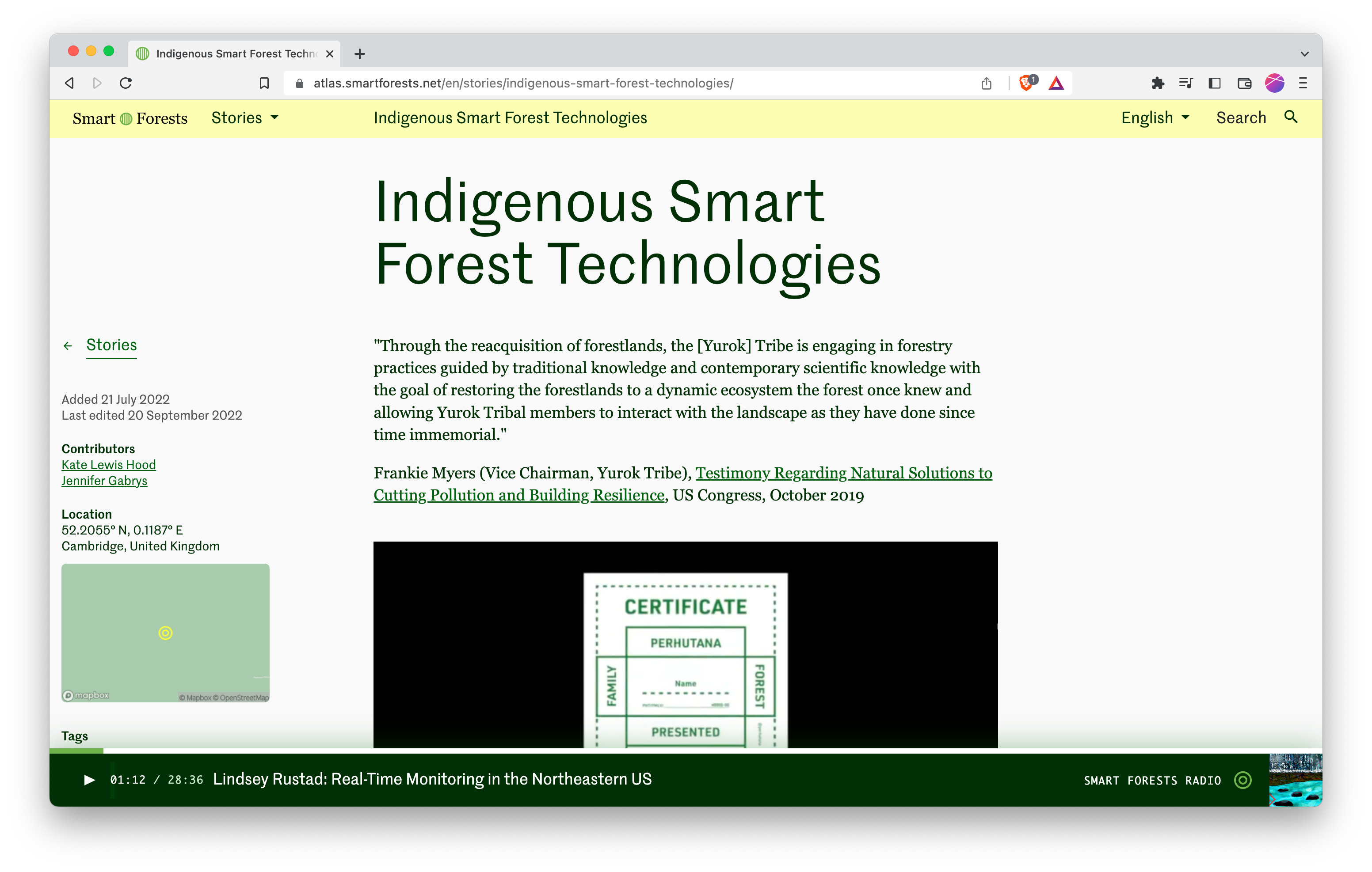
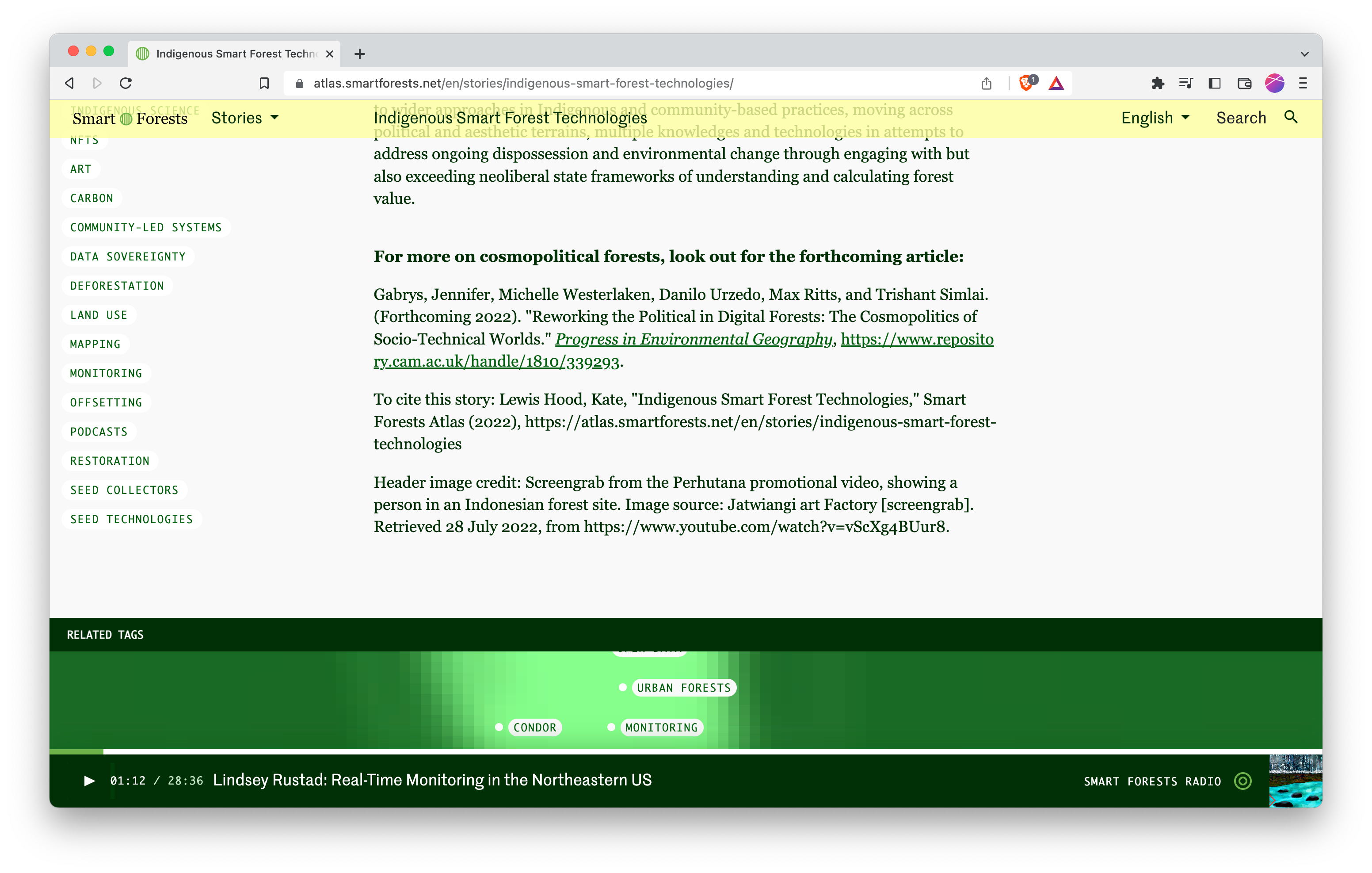
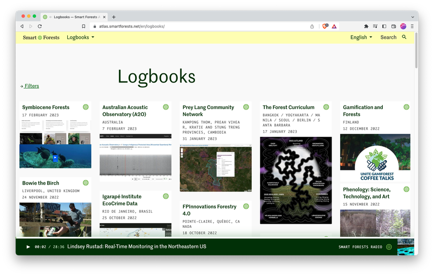
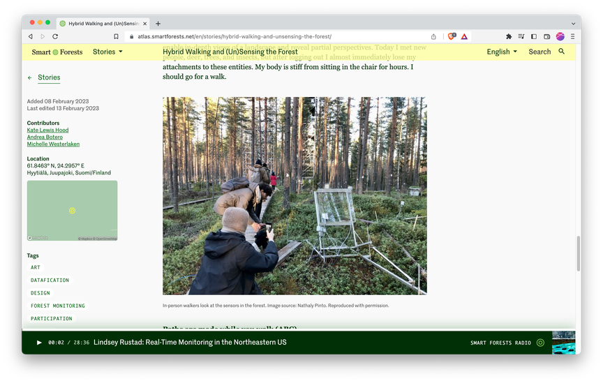
The Atlas is designed so that there are multiple entry points into the content: Logbooks, Map, Radio and Stories. This layered interface is designed to weave together a broad range of content from interviews to sensor data, soundscapes, and images, encouraging visitors to wander through the site according to their own interests.
The design of each wayfinding device is visually differentiated through icons, typography and content structure, while remaining densely interconnected through the tagging system.
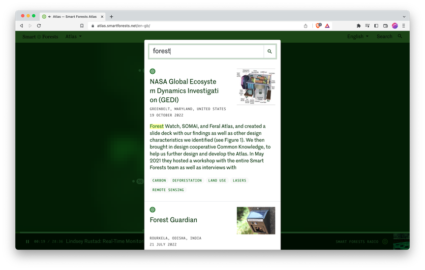
Logbooks are intended to be a digital working space where people can collect up rough ideas as they develop over time. We designed this so that individual logbook entries could themselves be tagged and thus connected to other parts of the site on a more granular level.
These are collected together and interlinked, eventually feeding in to the Stories, which are more polished and in-depth.
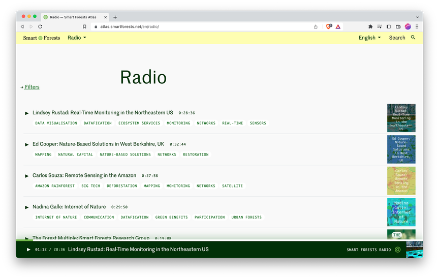
The Radio is an ever present feature that can play while you browse the rest of the site.
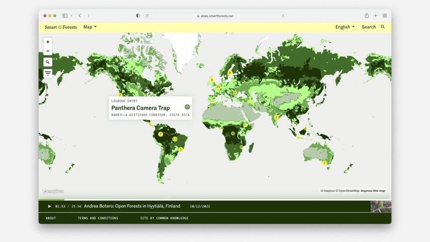
The Map is designed to situate the Atlas’ content geographically – it reappears on the metadata column of Logbook and Stories pages.
Tagging system
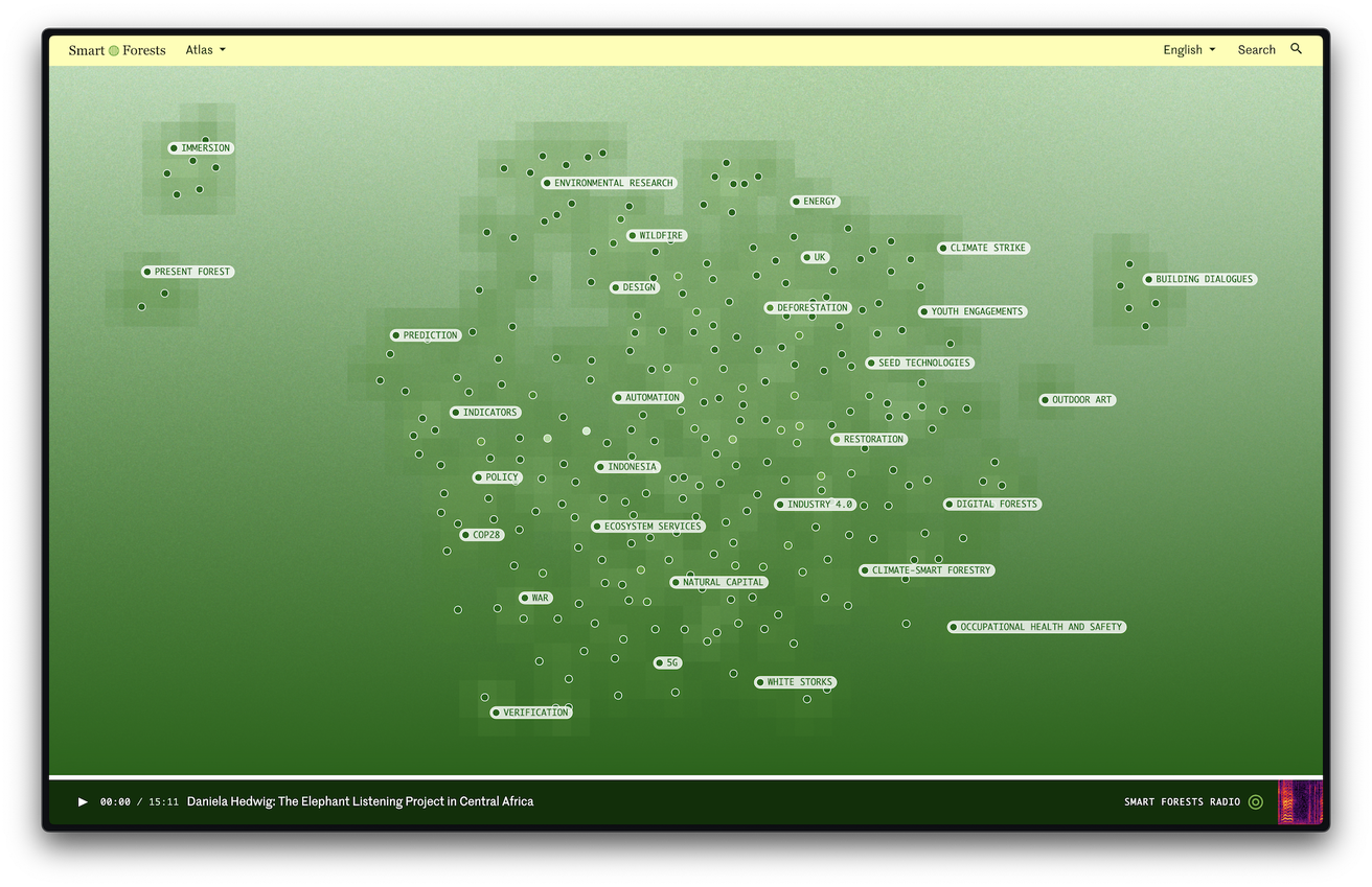
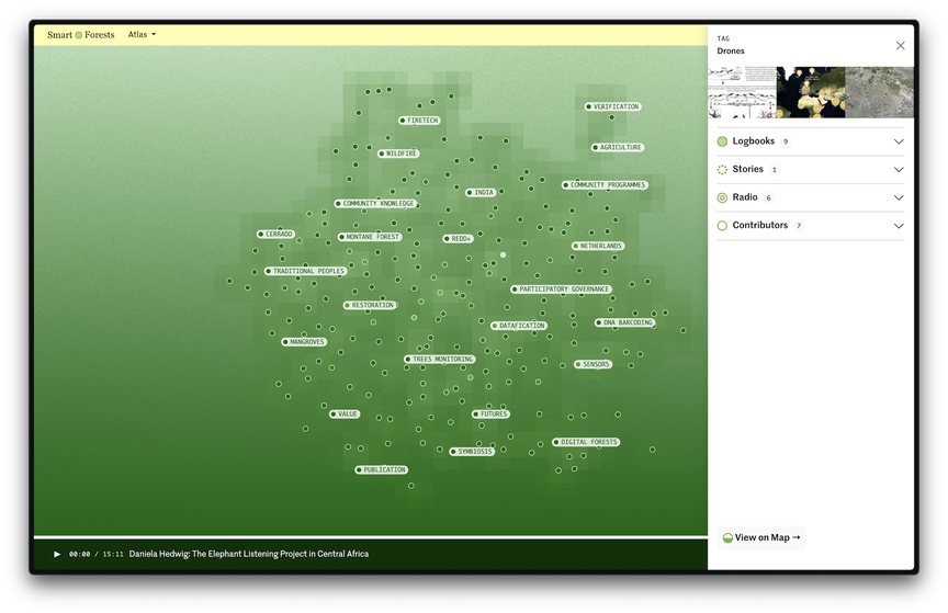
The tag cloud, which features on the homepage and at the bottom of each Logbook and Story, is one of the core ways that people navigate the site. Clicking one of the tags here will open a side panel that surfaces related content within all four wayfinding devices, as well as the contributors who have used that tag.
The tag cloud represents the Atlas in a visual and abstract way. It allows people to explore content intuitively rather than via a direct search, making space for emergent themes and unexpected connections. We chose tags, rather than a strict taxonomy of metadata, as the means of relating content within the Atlas. We wanted to remove any hierarchy between types of tags, allowing the content taxonomy to emerge from the bottom-up. It's not possible to view or understand the entire system from the top-down – you can only ever get a snapshot from any particular viewpoint.
The tag cloud surfaces the tags that are most frequently used and connected to other tags. In particular, it visualises relationships between pieces of content – even the unintentional ones.
Contributions
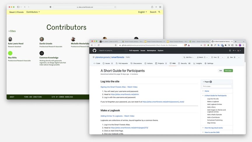
One of the important design considerations was how to invite participation from a range of contributors. We chose a CMS called Wagtail for its robust editor experience and granular editorial pipeline permissions. We wrote guidelines on how to the use the CMS, which is published on the wiki of Smart Forest’s public GitHub repository.
From the outset, we set up localisation so that people would be able to post in their own languages in future. We also set up a public API of the website content to enable people to use and appropriate the research themselves.
Tech stack
- Wagtail CMS
- Django
- React