Platform
Background
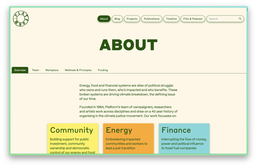
Founded in 1984, Platform’s team of campaigners, researchers and artists work across disciplines and draw on a 40 year history of organising in the climate justice movement. Their work is focused on efforts to:
- build support for community ownership and democratic control of our energy and food systems;
- embolden impacted communities and workers to lead a just transition;
- interrupt the flow of money and power to fossil fuel companies;
- harness the power of arts and culture to inspire social transformation; and
- develop ways of working that centre compassion, care and liberation .
Project goals
We had previously collaborated with Platform on their Offshore Voices project, so they approached us about working on a new site in 2022. The goal was to create something that reflected their rich history, unique organisational structure, and creative approach to climate organising.
Platform were using a WordPress site built almost twenty years ago (which is about 100 years in internet-time). Most of the team had given up on updating the site as many sections had stopped working. It didn’t reflect their current strategy or work — it just didn’t feel like them anymore.
Their new site is intended as a tool for radical change, providing inspiration and hope, as well as sharing practical learnings and methodologies.
Common Knowledge has totally transformed Platform’s website! They approached this challenging project with real skill: getting to know our team, audiences, history and vision deeply before working on some beautiful designs and developing a visual identity, digital archive and website we’re really proud of. I learned loads from them through the process and really appreciated their careful project management, and friendly, creative collaboration. We’re already working together on another project!
Marianne Brooker, Platform
Research process
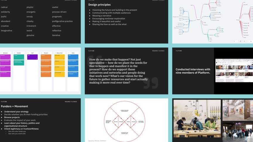
Platform are a non-hierarchical organisation (our favourite kind!) with rotating roles, flat structure and socially just pay, so we wanted to make sure that we began by listening to as many members as possible. We interviewed most of the core team, asking them to describe what Platform is to them, how we should communicate their new strategy, and what their ideas were for their future website.
These interviews informed our design principles for the site, which centred around encouraging nonlinear exploration, sharing process as well as ideas, and providing useful tools for the movement.
Visual identity
As it had been quite a while since their identity and website had been designed, we had quite a blank canvas to work with. We decided to keep their existing logo but to change almost everything else about the design language.
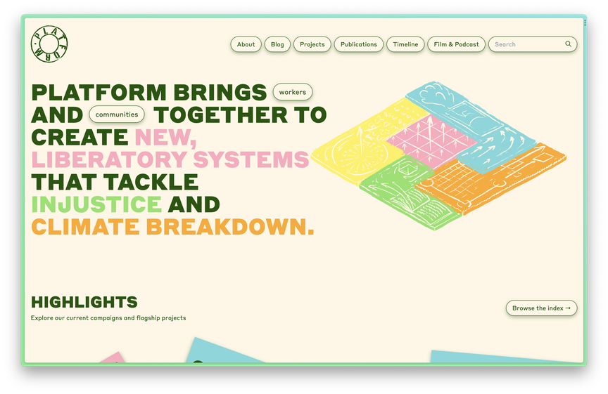
Our goal with the design was to communicate a sense of active hope , showing how Platform are nurturing the seeds of solutions and cultural shifts as well as organising against oppression. Throughout the design process, we looked for ways to foreground what we thought was most interesting and inspiring about Platform: that they are not only helping people imagine radically different futures, but also finding ways to build alternative infrastructures in the present.
We are committed to the idea that visioning an alternative is the first concrete step towards any kind of action.
Quote from one of our research interviews
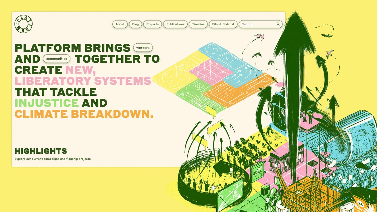
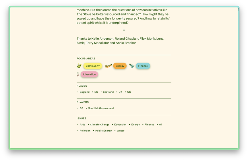
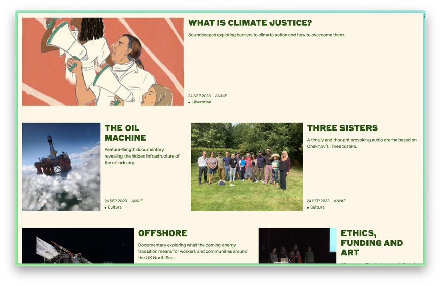
We worked with one of our favourite illustrators, Ilyanna Kerr , to bring this vision to life in a series of five interlocking illustrations that symbolise each of their focus areas: community, energy, finance, culture and liberation.
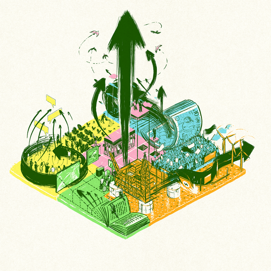
Towards the end of the project we created guidelines and templates so that anyone in the organisation would be able to create content using their visual identity.
Archive as catalyst
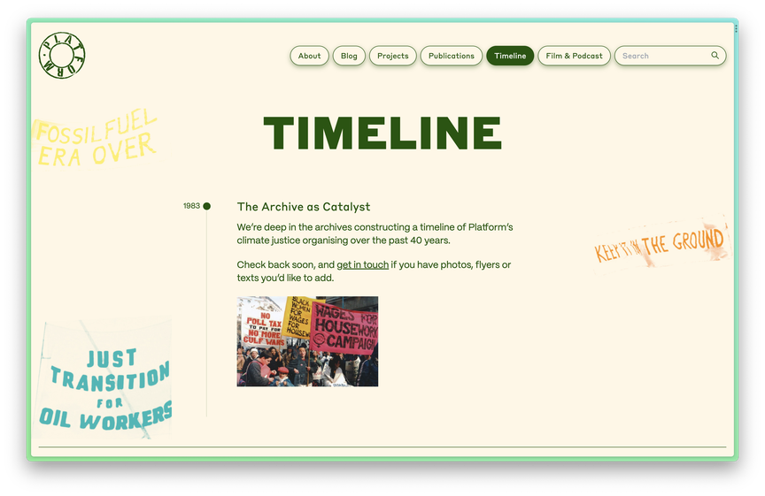
We wanted the new site to celebrate Platform's 40-year history. However, one of the challenges that we had to work with was that the quality of documentation over this time has varied considerably. The organisation has also shifted focus and shape considerable over that time, so what they were doing decades ago isn’t necessarily relevant to their work today. We decided to solve this by adding a timeline page to the website to celebrate their history without the need for a comprehensive archive.
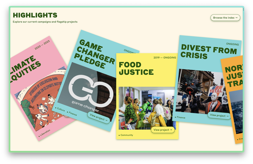
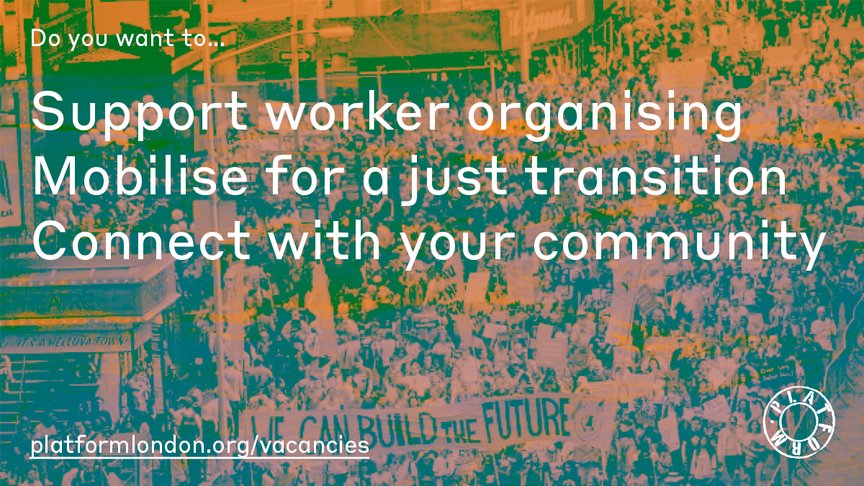
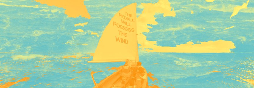
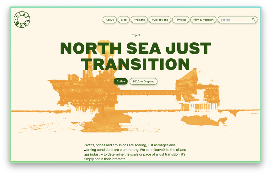
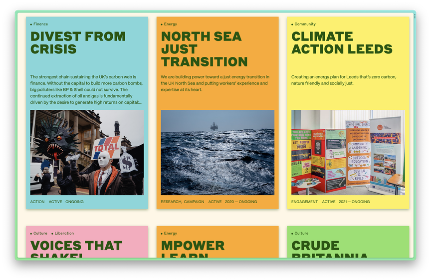
To represent the breadth and diversity of Platform’s work in a more abstract way, we also developed a system for using images of their past projects, which were often somewhat low quality, in colourful collages which can be seen throughout the site. It is also possible for editors to upload duotone images to the headers and margins of project pages. This creative use of their archive highlights the overlaps and interdependencies between projects, creating unexpected connections and combinations.
Interconnected focus areas
Although Platform’s progression as an organisation has not necessarily been linear, but there are connections throughout all their projects and focus areas. They believe that solutions to the climate crisis must be deeply integrated with other struggles, including improving working conditions and having ownership of energy and food systems.
The opportunity to change our food systems has to be fundamentally linked to improving working conditions, access to and ownership of raw materials. All of these things present an opportunity for us to be talking about solutions in really deeply integrated ways.
Quote from one of our research interviews
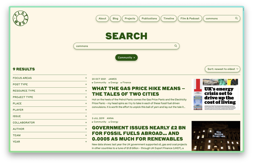
The website aims to show these connections, pointing to the overlapping themes and providing something of an overarching narrative. This also has an internal benefit as it helps bring together the autonomous individuals and projects within Platform.
Overall, Platform's new website and identity design is creative, joyful, radical, and energetic. It reflects their rich history, unique organisational structure, and creative approach to organising. It serves as a platform for showcasing their work, inspiring change, and fostering connections within and beyond their organisation.
Gemma Copeland, Arby Hisenaj
Joaquim de Souza, Anna Cunnane
Ilyanna Kerr
Anna Tokareva, Marianne Brooker
WordPress
Styrene B, PP Mori